Welcome!

Join our community of MMO enthusiasts and game developers! By registering, you'll gain access to discussions on the latest developments in MMO server files and collaborate with like-minded individuals. Join us today and unlock the potential of MMO server development!

Join Today!

stupefied

Newbie Spellweaver
Joined
Apr 27, 2014
Messages
6
Reaction score
0
Hi everyone! I will be doing the opposite to stupefying you guys on this thread.
I've gone through a few threads in the graphics sections on here and really, my esteem has dropped (you guys are too good ;~;).
I haven't seen any business cards done on here, so, here's mine because of that and because they're one of my most recent works.

I'm pretty new to this, so I've only made 2 so far.

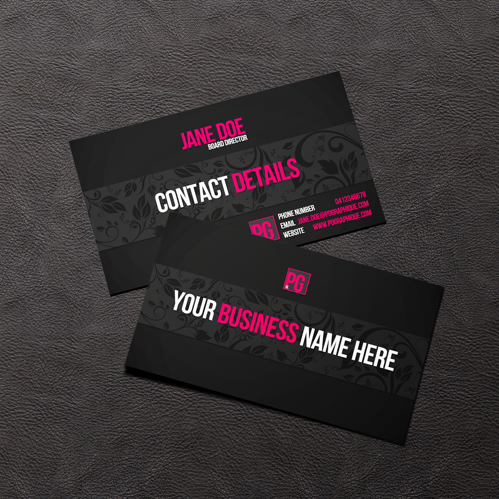
1. Vintage Flowers
stupefy - stupefied - RaGEZONE Forums

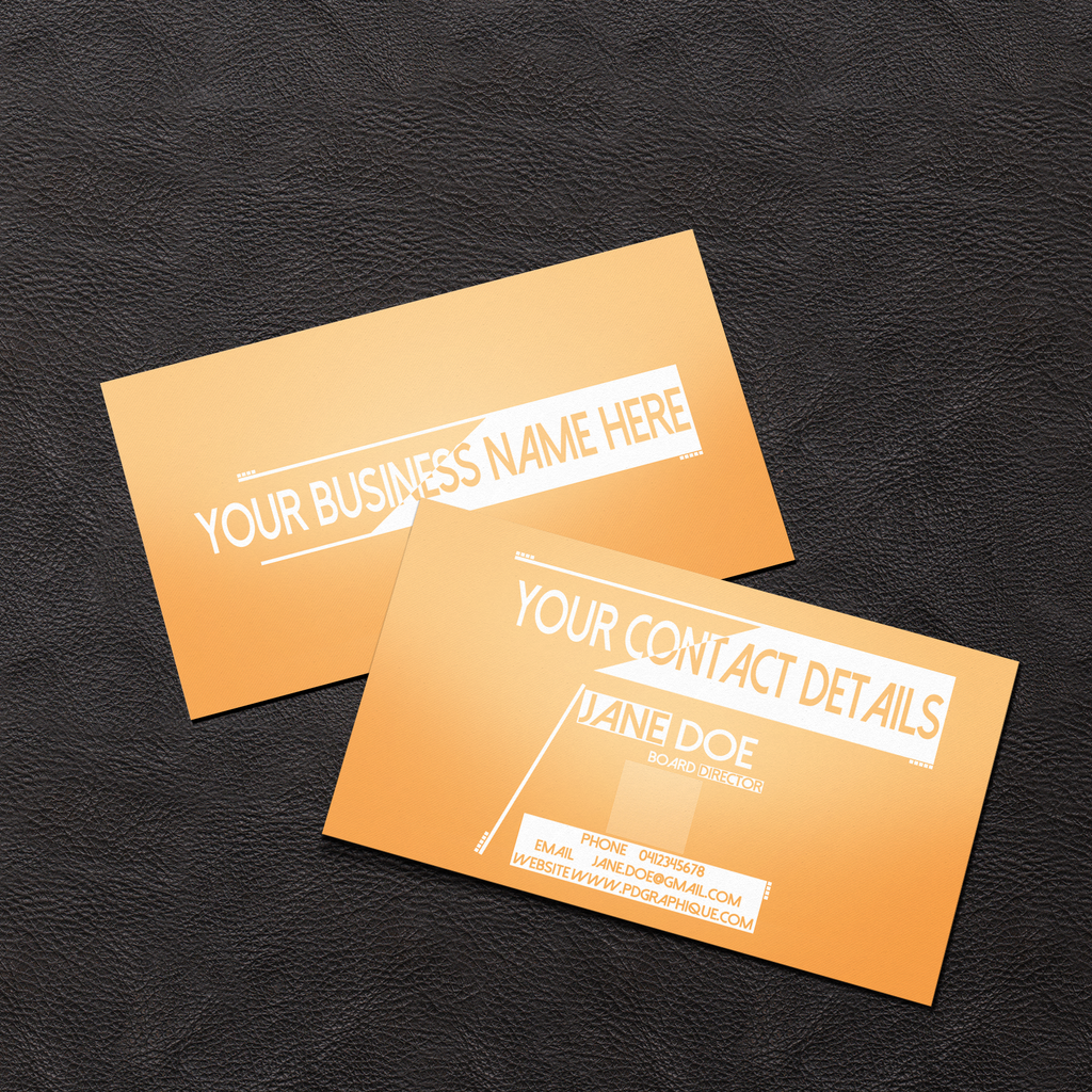
2. Chemical Business
stupefy - stupefied - RaGEZONE Forums


Thanks for viewing. :~)
 
Master Summoner
Joined
Jun 27, 2012
Messages
549
Reaction score
78
- the first one looks good. Maybe make the "PG" more in the middle of the box? (8/10)
- the second one looks ok. The details box doesnt look good ( the text should be changed). Doesnt really look like a business card for a chemical company (6/10)
 
Newbie Spellweaver
Joined
Apr 27, 2014
Messages
6
Reaction score
0
Are you framedpirateer?
ya.

- the first one looks good. Maybe make the "PG" more in the middle of the box? (8/10)
- the second one looks ok. The details box doesnt look good ( the text should be changed). Doesnt really look like a business card for a chemical company (6/10)
1. oh the pg is a logo. XD
2. yeah, i don't really like my 2nd one that much, but it's done. It's not got a chemical company either. It's just named that cause I didn't know what to name it and the background reminds me of measuring cylinders.
 
Joined
Jul 2, 2008
Messages
737
Reaction score
278
First one is good, I could see it being used for a business but I think the logo on the back of the card should be on the bottom right instead of top middle.
With that said, don't like the second card at all. The side with the contact details isn't "balanced." There are too many things going on which throw it off. The left side of the card has nothing but a stylus which gives it a sense of being "light" and the right side has the white vector block (the one used for "contact details") is overwhelming that side which makes it seem "heavy." It just looks weird in my opinion.
 
Newbie Spellweaver
Joined
Apr 27, 2014
Messages
6
Reaction score
0
First one is good, I could see it being used for a business but I think the logo on the back of the card should be on the bottom right instead of top middle.
With that said, don't like the second card at all. The side with the contact details isn't "balanced." There are too many things going on which throw it off. The left side of the card has nothing but a stylus which gives it a sense of being "light" and the right side has the white vector block (the one used for "contact details") is overwhelming that side which makes it seem "heavy." It just looks weird in my opinion.

thanks, will keep that in mind for future designs xD
 
Back
Top