Welcome!

Join our community of MMO enthusiasts and game developers! By registering, you'll gain access to discussions on the latest developments in MMO server files and collaborate with like-minded individuals. Join us today and unlock the potential of MMO server development!

Join Today!

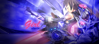
Anime Signature

dat face
Loyal Member
Joined
May 25, 2012
Messages
1,738
Reaction score
621
where is everyone ? i have made a bunch of signatures lately ..


dat face
Loyal Member
Joined
May 25, 2012
Messages
1,738
Reaction score
621
another signature ~


Preparing
Loyal Member
Joined
Sep 18, 2011
Messages
1,104
Reaction score
257
Good depth on the 1st one. And that dragon one is awesome. Can you share the render link?
 
Initiate Mage
Joined
Jan 3, 2013
Messages
3
Reaction score
0
I'm back ~


what do you think ?

Overall is good and the more you stare it the more you will like that SIG, hope you can make them animated :p:
 
dat face
Loyal Member
Joined
May 25, 2012
Messages
1,738
Reaction score
621
Overall is good and the more you stare it the more you will like that SIG, hope you can make them animated :p:

thank .. Still learning how to make awesome animated graphic in photoshop .. :D
 
dat face
Loyal Member
Joined
May 25, 2012
Messages
1,738
Reaction score
621
Good depth on the 1st one. And that dragon one is awesome. Can you share the render link?
sory for late reply , here the link

New sig for this week ,


dat face
Loyal Member
Joined
May 25, 2012
Messages
1,738
Reaction score
621
up2 ..
 
dat face
Loyal Member
Joined
May 25, 2012
Messages
1,738
Reaction score
621


no one gonna leave some feedback ?
 
R.I.P Millercent
Loyal Member
Joined
Nov 6, 2012
Messages
2,230
Reaction score
314


no one gonna leave some feedback ?

I'm not a big fan on anime, how ever that looks pretty neat. What works well is the green fading and the deep but rich red as those colours always fit well when done correctly.

Nice effort amigo, great work. Going to look over the rest of your work :): Keep it up.
 
Newbie Spellweaver
Joined
Jun 4, 2014
Messages
9
Reaction score
4
Seeing as no one's given you CnC for all these great tags you've made..

sory for late reply , here the link

New sig for this week ,

This one is pretty well done. I like the clearly cut three colors and the direction. It's a nice way of incorporating that weird render. But some suggestions? Maybe try darkening the upper right a bit more, so it matches the bottom left a bit, and, blur / darken / do something with the C4Ds in the background so they blend in a bit more / don't detract from your focus, which is very strongly your render. The gun blends into your background, which might not be desirable. The blurry shape in front looks a bit.. too blurry in comparison to the rest of the sharpness, so maybe incorporate that in a bit more too. The text, imo, is well done. The colors are well chosen, and it's fitting. I feel the area behind "hitman" could be burnt a bit so the letters slightly stand out more, but, it's great! :)


Loki is creepy. I've never watched those movies much but.. he's creepy. D: But regarding your tag, I really like your colors (again) and your choice of render and your text! The glow might be a bit strong I feel, but it's pretty cohesive. One thing I might change is the usage of C4Ds though. Your render seems to pop out of the page, and I feel that if you used a few of those C4Ds that converged towards a point, it could help your render look like it's jumping out a bit more. Emphasize the motion, as it's one of the key points of that render. The depth is pretty nicely done--foreground blurry, render crisp, background slightly more blurry. That's especially nice in how the cloak seems to flow into the background.


Great atmosphere! Colors, the blue reflection, and the red on the other side. It's really nice how you picked up on that. Only thing I might change would be the text, which feels a bit heavy for this more elegant piece. (The shadows on soldier are cool though). The orange could be a bit less saturated and more reddened (maybe), but, otherwise, looks good.


This kind of feels like it lacks focus imo, and the claws are cut off. Again, great colors, great background, great blending! The overall shadows are good, and the hazy atmosphere is well, pretty, but the render feels overly sharp in contrast. Maybe if you could focus on it a bit more and tone down the sharpness?

 
dat face
Loyal Member
Joined
May 25, 2012
Messages
1,738
Reaction score
621
I'm not a big fan on anime, how ever that looks pretty neat. What works well is the green fading and the deep but rich red as those colours always fit well when done correctly.

Nice effort amigo, great work. Going to look over the rest of your work :): Keep it up.

thank for the feedback ~ :D:


Seeing as no one's given you CnC for all these great tags you've made..

mate I really appreciate it ~ I'm gonna try improve my skill from time to time .. thank you mate ..
 

Rey

The Shrewd
Loyal Member
Joined
Oct 29, 2011
Messages
1,336
Reaction score
196
I made a signature with the same render, ill post it later on my signature work thread.
 

Rey

The Shrewd
Loyal Member
Joined
Oct 29, 2011
Messages
1,336
Reaction score
196

Thats good, but i think it would be better if you've put the light source between the C4D render and the character render.
 
Preparing
Loyal Member
Joined
Sep 18, 2011
Messages
1,104
Reaction score
257
Maybe you could give the tag a highpass? Go to filters> Others> highpass > and give 0.9 or 1 pixel, then set it to overlay or soft light. Whichever looks good.
This helps to define the tag more.
I like the background of the halo sig. Maybe you could try give a gaussian blur to it? To add more depth.
Heheh you could also add lightning to his helmet. Maybe a flare could also work good here.
I like the text good job with that. But imo, the glow spread does suit the text.

Good work nonetheless. Kiu, and kek ( keep em koming :p:
 
Master Summoner
Joined
Jun 27, 2012
Messages
549
Reaction score
78
CnC is based on all of yiur images in the last few days:
- You have learned or are using a good text style now. You are matching the colors of the text to the image and making the text stand out nicely. Its not perfect though. Texts like efan in the Loki sig and Solider need their colors to be reworked.
- It seem to blurring is an issue still, but I think its just a style I dont like. The only blurring I likedwas in your Loki sig.
- You are blending your colors nicely. I would suggest always having three or more colors in a sig.

I suggest more work on the blurring. Text placement has gotten better; as well as the way it is written.
 
Back
Top