Welcome!

Join our community of MMO enthusiasts and game developers! By registering, you'll gain access to discussions on the latest developments in MMO server files and collaborate with like-minded individuals. Join us today and unlock the potential of MMO server development!

Join Today!

Blure's Signatures

Junior Spellweaver
Joined
Oct 4, 2009
Messages
167
Reaction score
38
Agree with what creeps has been telling you for the most part, there's still lots of ground for you to cover and many years to come messing with photoshop until you can talk the way you do [hell, i still consider myself pretty noobish at times after doing this for more than half a decade]


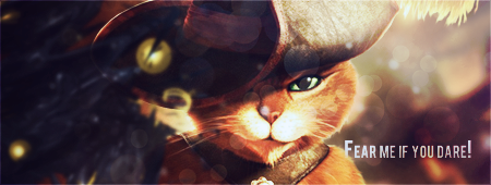
you do have the potential to be a great designer as long as you remember to keep your head down, especially this one could have been SO MUCH BETTER with proper text, correct sharpening and some blurring, maybe changing the lightning a little and getting some dept. also scanlines going on top of the whole render? well, designers choise... [altho, the scanlines are awesome in this otherwise, might be what makes it stand out in my eyes so much]


and then, the last one, it already has a lot more to it, depth and lighting and all, but your text really needs some work [some=A LOT]
 

Rey

The Shrewd
Loyal Member
Joined
Oct 29, 2011
Messages
1,336
Reaction score
196
Since that whole comment I got from Sparkler I tried to do something new, a completely new style, and since I don't know to use C4D's really nice, I tried something like this:
Blure Shadow - Blure's Signatures - RaGEZONE Forums

Its amazing .. so amazing :D
 
Junior Spellweaver
Joined
Oct 11, 2013
Messages
129
Reaction score
33
Well, I made another one ,dedicated to someone special :p anyway, I know the text is bad, I just don't know what to do with it.


EDIT:
Made 4 other:


Last edited:
Junior Spellweaver
Joined
Oct 4, 2009
Messages
167
Reaction score
38
Well, I made another one ,dedicated to someone special :p anyway, I know the text is bad, I just don't know what to do with it.


EDIT:
Made 4 other:


these are all MUCH better than your previous work, however instead of quantity you should focus on quality for a while...
 
Junior Spellweaver
Joined
Oct 11, 2013
Messages
129
Reaction score
33
Blure Shadow - Blure's Signatures - RaGEZONE Forums

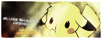
this is cute!
Where can I find the render?
I found it on google images under "Pikachu Render"
Here it is:
Blure Shadow - Blure's Signatures - RaGEZONE Forums
these are all MUCH better than your previous work, however instead of quantity you should focus on quality for a while...
After I learn a new style, I usually practice a lot, that's how I do it, so I can learn it better.
 
Last edited:

Rey

The Shrewd
Loyal Member
Joined
Oct 29, 2011
Messages
1,336
Reaction score
196
i LOVE your new joker one :D
 
Junior Spellweaver
Joined
Oct 11, 2013
Messages
129
Reaction score
33
Here I am, with 2 new signatures:


Junior Spellweaver
Joined
Oct 11, 2013
Messages
129
Reaction score
33
Bump. I'd like to request a critique for the last 2 sigs (Red demon and Zombie) from some advanced GFX artist.
 
Junior Spellweaver
Joined
Oct 4, 2009
Messages
167
Reaction score
38
Bump. I'd like to request a critique for the last 2 sigs (Red demon and Zombie) from some advanced GFX artist.


Here I am, with 2 new signatures:


pros
  • Lighting
  • colours
  • pretty good contrast between sharp and blurry, although the renders could stand out bit more
  • actually nice usage of c4d's compared to your previous works
  • decent effects

cons
  • lack of any kinds of borders (yes it's artist's choise, but would improve those signatures so much)
  • upper one totally lacks dept, the bottom one has already some
  • FOR GOD's SAKE, TRY SOME OTHER FONTS AND TEXTSTYLES!!
  • textpositioning is horrible (Although I'm not the one with any business ranting on this one)

bottom line is: you are progressing but there's still tons of room to improve
 
  • Like
Reactions: Rey
Junior Spellweaver
Joined
Oct 11, 2013
Messages
129
Reaction score
33
pros
  • Lighting
  • colours
  • pretty good contrast between sharp and blurry, although the renders could stand out bit more
  • actually nice usage of c4d's compared to your previous works
  • decent effects

cons
  • lack of any kinds of borders (yes it's artist's choise, but would improve those signatures so much)
  • upper one totally lacks dept, the bottom one has already some
  • FOR GOD's SAKE, TRY SOME OTHER FONTS AND TEXTSTYLES!!
  • textpositioning is horrible (Although I'm not the one with any business ranting on this one)

bottom line is: you are progressing but there's still tons of room to improve
The thing is that both of them have a small border, inner stroke, white, screen, 1px :) you can see it on a black bg, Also, I already use styles for the text, you can see it has a "glass-ish" style, on both sigs, and the text positioning, I don't know where to put it xD
Thanks for the comm, I'm waiting for others too :)
 
Junior Spellweaver
Joined
Oct 4, 2009
Messages
167
Reaction score
38
The thing is that both of them have a small border, inner stroke, white, screen, 1px :) you can see it on a black bg, Also, I already use styles for the text, you can see it has a "glass-ish" style, on both sigs, and the text positioning, I don't know where to put it xD
Thanks for the comm, I'm waiting for others too :)

checked on black bg and those borders look nice!

about the texts.. i meant you should try some OTHER textstyles and fonts too, because so far every or atleast majority of your signatures use exact same style and exact same font.
In my opinion you should experiment with different fonts and different styles and make the the fonts really fit the signature, to look good and be easily readable

One thing ive been thinking of your texts all along is that you should really use drop shadow and very-very subtle and light glow to make your texts more readable.
 
Last edited:
GFX Maniac
Loyal Member
Joined
Feb 20, 2011
Messages
991
Reaction score
164
checked on black bg and those borders look nice!

about the texts.. i meant you should try some OTHER textstyles and fonts too, because so far every or atleast majority of your signatures use exact same style and exact same font.
In my opinion you should experiment with different fonts and different styles and make the the fonts really fit the signature, to look good and be easily readable

One thing ive been thinking of your texts all along is that you should really use drop shadow and very-very subtle and light glow to make your texts more readable.

I'll have to disagree with that one. Never use drop shadow in a typo, it'll ruin the whole signature depth
 
Back
Top