Welcome!

Join our community of MMO enthusiasts and game developers! By registering, you'll gain access to discussions on the latest developments in MMO server files and collaborate with like-minded individuals. Join us today and unlock the potential of MMO server development!

Join Today!

Been a long while..

Newbie Spellweaver
Joined
Jul 8, 2010
Messages
19
Reaction score
1
Hello fellow ragezoners. Been awhile since i've last posted here, since I do put my stuff on Sig Labs now. Check out a few of my new stuff.

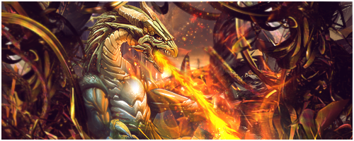
+ Ecstasy - Been a long while.. - RaGEZONE Forums


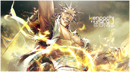
+ Ecstasy - Been a long while.. - RaGEZONE Forums


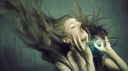
+ Ecstasy - Been a long while.. - RaGEZONE Forums


Leave any cnc!
 
Newbie Spellweaver
Joined
Jul 8, 2010
Messages
19
Reaction score
1
Thanks for the feedback!

@FlashX Usually with CnC you want to be sort of specific.. In what way do I need to work on with my focals?
 
Junior Spellweaver
Joined
Aug 12, 2012
Messages
106
Reaction score
19
Well i wasnt in the mood to be specific, your focals either blend too much or dont blend at all.
zaraki doesnt blend alot and the smudge sig..well its smudge it blends gud, youre not all that bad with the smudge tool.
Ima get a bit more constructive...

First sig:
as i said, focal. its just not right to have a bg layer behind it and blurred, and c4ds above it[dragon] blurred yet again. i understand its depth, but its a bit overdone?
i dislike the blurred C4d's, the style is good though, remove the shadow on the fire breath right in his mouth.
good sparkle-ish effect, gave it a hot environment.

2nd:
too randomish effects, should of made em bursting out of the focal towards the edges.
the zaraki render is more for a smudge sig.+text could be a bit closer to him? too far for me.

3rd:Well...its a smudge sig..lol.

good job, i wouldnt mind seeing more from you.
 
Junior Spellweaver
Joined
Apr 8, 2012
Messages
117
Reaction score
31
I love it all but the 1st one and the last was alittle bit icky .
but still , awesome designs :D
 
Newbie Spellweaver
Joined
Jul 8, 2010
Messages
19
Reaction score
1
@FlashyX
Thanks for the feedback! Though I do disagree with you on some points, if you're not in the mood then you shouldn't have posted at all, because attitude and the way you feel affects good critique. You did point out great things that I will put into consideration though! I just believe that there is no ONE or CORRECT way to do a focal, it's on how the artist perceives it. Everything is an opinion though, so I thank you for taking your time for your constructive feedback, honestly. :):

@SiiJei
The last one is an all smudge sig, but I do agree with the other one. It is clustered, and well icky. Thank you for your feedback.

@Silver060
I can if you really desire one. Post a picture/render on my profile and i'll see what I can do!
 
Banned
Banned
Joined
Feb 14, 2007
Messages
1,405
Reaction score
220
I like that second picture jn this post. maybe you can make that one with my name.

2
 
Junior Spellweaver
Joined
Aug 12, 2012
Messages
106
Reaction score
19
i meant i wasnt in the mood when i wrote the first post, second one went fine ;D.
happy i could help~
 
Banned
Banned
Joined
Feb 14, 2007
Messages
1,405
Reaction score
220
Can you make the second one for me, i like that really much. Make that one with my name much appreciated.
 
Joined
Jul 2, 2008
Messages
737
Reaction score
278
First tag:

Too much going on. There is too much attention attracted towards the background, which makes it look messy.
I think if those C4D's or whatever that mess is, was removed from the background, and it was blurred a little, with some lighting changes, it would look good.
Should have focused on the fire more, and expanded the effects around it, would look great.

Second tag:

Looks good, however, should have some lighting corrections to make it look good.
For example, there is brightness at the bottom right part of the canvas, which takes attention away from the focal (which I'm guessing was supposed to be the render).

Third tag:

I like the smudging, I think you made the canvas too big for this signature, because all there is added is the ball of blue "energy" (you could call it that, I guess),
and there is quite a large amount of open space which is just empty, which makes it look "unbalanced". However that could also be fixed, if the background was blurred, and darkened, with a light source shining down from top of the render.
 
Custom Title Activated
Loyal Member
Joined
Oct 23, 2005
Messages
6,598
Reaction score
5,565
I love the last one! Really has a dreamy feel to it, like it is some sort of fantasy.
 
Mythic Archon
Joined
Oct 15, 2012
Messages
700
Reaction score
503
These are nicely done! Only thing I'd comment on somewhat negatively is the last one. The edges of her hair look sharp and naff in certain placements. Other than that, gj.
 
Back
Top