- Joined
- Jul 11, 2010
- Messages
- 459
- Reaction score
- 232
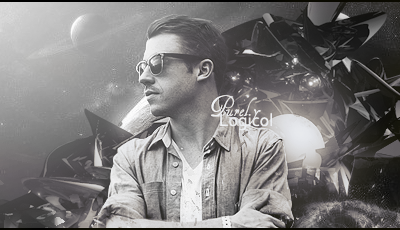
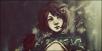
Long time since I last post any gfx, so here are my newest ones 


Join our community of MMO enthusiasts and game developers! By registering, you'll gain access to discussions on the latest developments in MMO server files and collaborate with like-minded individuals. Join us today and unlock the potential of MMO server development!
Join Today!

thats nice , you need a character focusinggood job tho
Thanks!well... I think the focusing are on the chars


Do you have any clue of what you're talking about?thats nice , you need a character focusinggood job tho
Do you have any clue of what you're talking about?
First signature, if he tries to "focus the character" or bring attention to the focal point even more, it'll just look like Macklemore is slapped on a canvas and the background is irrelevant to the signature.
The second signature is almost perfect, there is not much you can add to it. The render is perfectly blended with the background so it is not thrown off at all, the light source seems to extend properly throughout the whole signature except at the middle of the canvas there could be some work done there. The text could use some work, I assume you tried to make it balanced with the flow, but it should be a little more curved for it to do so.

