Welcome!

Join our community of MMO enthusiasts and game developers! By registering, you'll gain access to discussions on the latest developments in MMO server files and collaborate with like-minded individuals. Join us today and unlock the potential of MMO server development!

Join Today!

Expertise - Corporate Webdesign

Status
Not open for further replies.
Joined
Mar 31, 2012
Messages
1,924
Reaction score
1,013
Hello,

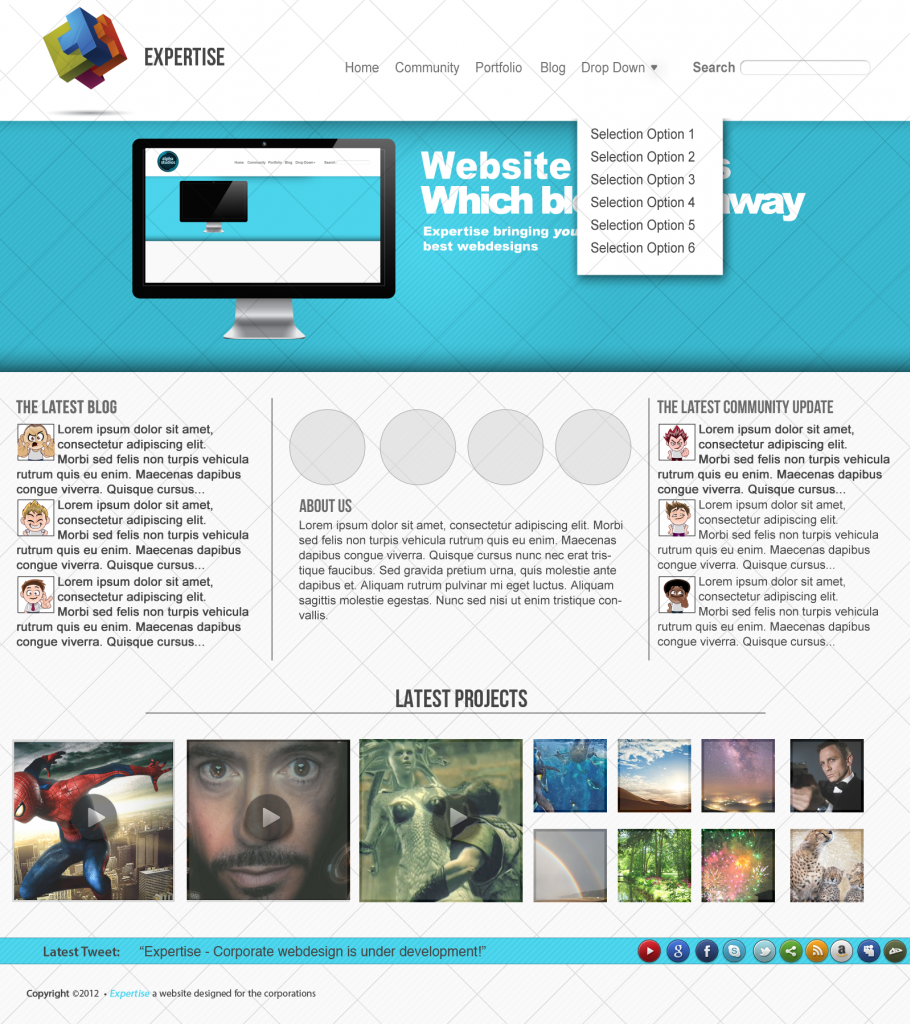
So yesterday I spent some of my day designing a website, but I don't know how it turned out, please give constructive criticism and be respectful!

Current Version:
Version 4:
Cyndaquil - Expertise - Corporate Webdesign - RaGEZONE Forums


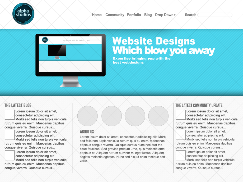
Previous Versions:
Version 1:
Cyndaquil - Expertise - Corporate Webdesign - RaGEZONE Forums

Version 2:
Cyndaquil - Expertise - Corporate Webdesign - RaGEZONE Forums

Version 3:
Social Icons off:
Cyndaquil - Expertise - Corporate Webdesign - RaGEZONE Forums

Social Icons on:
Cyndaquil - Expertise - Corporate Webdesign - RaGEZONE Forums
Version 4
Cyndaquil - Expertise - Corporate Webdesign - RaGEZONE Forums


Thank You!
 
Last edited:
GFX Maniac
Loyal Member
Joined
Feb 20, 2011
Messages
991
Reaction score
164
I like it, but try to change the colors of the text and boxes below, complete black makes it look weird.
 
Joined
Mar 31, 2012
Messages
1,924
Reaction score
1,013
So you are not accepting my GOOD advise? I am letting you know the design should not be so basic.

I actually shouldn't even be talking to you since you can't even design a better web site than this, Now please take your own advise and leave my thread alone.

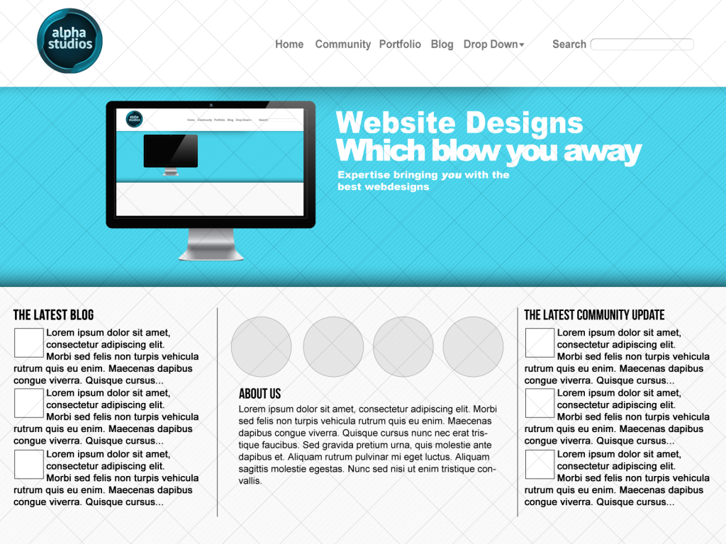
Version 2 - Taking on Skazz's Comments

Cyndaquil - Expertise - Corporate Webdesign - RaGEZONE Forums
 
Last edited:
Newbie Spellweaver
Joined
Sep 28, 2012
Messages
16
Reaction score
13
Sorry mate, I gave you constructive criticism but a certain kidd (haha) thought it'd be considered spam and deleted it.
/lol

Anyways, the gist is:

Your design has flaws. It certainly isn't the worst I have ever seen though. In fact, I've seen much worse.
While simplistic things are nice, you still need the right way to go about it.

How about using some gradients? For example in your header area.
Use a gradient maybe? Make it more interesting to the user's eye.

And maybe use some simple layer effects such as, again, a gradient (maybe soft grey going into white). Or some drop shadow and 1px stroke #black on rather low opacity to have it stand out a little?

And I don't quite like, that you left out the example images. It feels very hallow and empty. I'd put in some example images for the sake of appearance.
 
Joined
Mar 31, 2012
Messages
1,924
Reaction score
1,013
Sorry mate, I gave you constructive criticism but a certain kidd (haha) thought it'd be considered spam and deleted it.
/lol

Anyways, the gist is:

Your design has flaws. It certainly isn't the worst I have ever seen though. In fact, I've seen much worse.
While simplistic things are nice, you still need the right way to go about it.

How about using some gradients? For example in your header area.
Use a gradient maybe? Make it more interesting to the user's eye.

And maybe use some simple layer effects such as, again, a gradient (maybe soft grey going into white). Or some drop shadow and 1px stroke #black on rather low opacity to have it stand out a little?

And I don't quite like, that you left out the example images. It feels very hallow and empty. I'd put in some example images for the sake of appearance.

Thank you :) I will take it on board and get some images ;)
 
SK CREATIONS
Loyal Member
Joined
Jun 26, 2007
Messages
1,053
Reaction score
619
Sorry Xdrac,
So much spam relating to the previous issue with snippets in every ones post.
I simply deleted any comment that mentioned it or had a point in it about the issue.
 
Web & Interaction Design
Loyal Member
Joined
Dec 18, 2010
Messages
1,506
Reaction score
712
The footer kills it for me. The social icons don't help matters. If you want to include so many icons, increase the height of the footer and stack them to make them look more organised. A tooltip upon hover would be nice, too.

The colour of the footer looks rather peculiar. It doesn't match any colour in the design - despite being blue like the slider/ banner. It is important that you remain consistent throughout. It's also important to use as little variations of a single colour as possible. If you want blue, use one shade and compliment it with another colour (pink, red or grey - for example). The two different shades look odd.

The logo is way to big for the header - and the drop-downs on the navigation are positioned far to low beneath the navigation items. As for the banner; the text is strange - there is a header text, but the text beneath is a larger font size? That's not great. The text below the 'two' titles, by the way, looks rather odd bold. There needs to be a distinguishable header/ body font according to size and weight.

Be careful of the width of content, too. The header, for example, is not as wide as the content in the banner and below. This looks odd. Please take this into consideration and I'd love to see the output.
 
Status
Not open for further replies.
Back
Top