Welcome!

Join our community of MMO enthusiasts and game developers! By registering, you'll gain access to discussions on the latest developments in MMO server files and collaborate with like-minded individuals. Join us today and unlock the potential of MMO server development!

Join Today!

Anime Signature

dat face
Loyal Member
Joined
May 25, 2012
Messages
1,738
Reaction score
621
I'm back ~


what do you think ?
 
Last edited:

Rey

The Shrewd
Loyal Member
Joined
Oct 29, 2011
Messages
1,336
Reaction score
196
Beautiful, I like it man !

BTW, WELCOME BACK !!!! I've missed you alot
 
Master Summoner
Joined
Jun 27, 2012
Messages
549
Reaction score
78
IMO:
- "bleach" text color should be darker
- background doesnt look that great. It looks as if you did a color gradient overlay of yellow and red
- lighting above (the white light) is in the wrong place
- renders need to be blended a little more

Its ok. Not really great 6.5/10
 
dat face
Loyal Member
Joined
May 25, 2012
Messages
1,738
Reaction score
621
Beautiful, I like it man !

BTW, WELCOME BACK !!!! I've missed you alot

thank man .. 4 month stop making sig .. now I'm back ..


IMO:
- "bleach" text color should be darker
- background doesnt look that great. It looks as if you did a color gradient overlay of yellow and red
- lighting above (the white light) is in the wrong place
- renders need to be blended a little more

Its ok. Not really great 6.5/10

Thank for the feedback .. my skill little bit rusty lol .. hehe .. gonna remember your advice ..
 
dat face
Loyal Member
Joined
May 25, 2012
Messages
1,738
Reaction score
621
I've been msg'ing u on ragezone + bbm, where the hell have you been ?!

Just doing some homework lol ..


Original Link :
 
dat face
Loyal Member
Joined
May 25, 2012
Messages
1,738
Reaction score
621
it's really hard to use 2 renders/characters in 1 tag, not to say it's impossible to get something good with it

yeap .. you right .. it's really hard .. I just want tried new thing
 

Rey

The Shrewd
Loyal Member
Joined
Oct 29, 2011
Messages
1,336
Reaction score
196
Just doing some homework lol ..


Original Link :

Nice blending !!!
 
Master Summoner
Joined
Jun 27, 2012
Messages
549
Reaction score
78
Just doing some homework lol ..


Original Link :

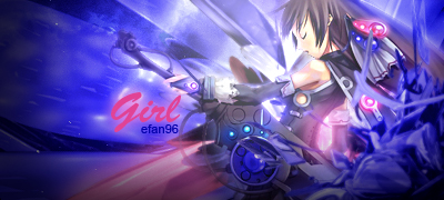
- text is overblended. It needs to stand out more and closer to the render.
- too much blurring has been done in a lot of areas. There doesnt seem to be a flow due to the blurring. The focus of the image is the render and the light is abovbacke him, but everything is blurred around him.
- a better background should be used.
- might look better with the render in the middle of the image

The biggest problem with this image is the over blurring. There is nothing wrong with blurring specific areas to blend the image, but when its overdone, the image loses a lot of quality. The text doesnt have any type of border or shadow to make it stand out. This should always be done to ensure your text to be seen clearly. It should also be as close to the render (if there is one). The background itself looks pretty bad, especially the right side and the "Wave-like" things going away from the render to the top left corner. The wave-like lines going towards the bottom left corner look good, but its over-blurred; the same can be said to the blending of the bottom of the render.

tl;dr over-blurred, needs better background, and text needs to stand out 4.3/10
 
dat face
Loyal Member
Joined
May 25, 2012
Messages
1,738
Reaction score
621
- text is overblended. It needs to stand out more and closer to the render.
- too much blurring has been done in a lot of areas. There doesnt seem to be a flow due to the blurring. The focus of the image is the render and the light is abovbacke him, but everything is blurred around him.
- a better background should be used.
- might look better with the render in the middle of the image

The biggest problem with this image is the over blurring. There is nothing wrong with blurring specific areas to blend the image, but when its overdone, the image loses a lot of quality. The text doesnt have any type of border or shadow to make it stand out. This should always be done to ensure your text to be seen clearly. It should also be as close to the render (if there is one). The background itself looks pretty bad, especially the right side and the "Wave-like" things going away from the render to the top left corner. The wave-like lines going towards the bottom left corner look good, but its over-blurred; the same can be said to the blending of the bottom of the render.

tl;dr over-blurred, needs better background, and text needs to stand out 4.3/10

yeah , I realize it .. Right now I just playing arround with new style .. Try and error is my method .. anyways thank for your long feedback .. I'm sure you very professional about signature ..


Master Summoner
Joined
Jun 27, 2012
Messages
549
Reaction score
78
yeah , I realize it .. Right now I just playing arround with new style .. Try and error is my method .. anyways thank for your long feedback .. I'm sure you very professional about signature ..


Im a mediocre designer. I use GIMP and Inkscape to create my images, so I lack a lot of things that users have with Adobe. You can try and improve from the advice if you think its worthy or you can disregard it; I just like to voice my opinion in an area that allows me to :p:

as for the latest image, IMO:
- font is visible, but it needs to be "spiced up." Always strive to have an effect on every text, whether its big or small
- there is a little too much blur to the right hand area. the lightning effects should be less blurred
- the render may look better in the middle. I would have made the image smaller if I kept the render in the position its in the image
- maybe adding a c4d would fill the image a bit more

This one is better than the second one and is a tad better than the first one. There are still a lot of areas blurred to the max (or close to max); need to minimize that. Basic fonts are fine, but adding some effects to them, whether it be an overlay of the background, a drop shadow, or colored border, would make it look a lot better. 6.7/10

(I think render is doing most of the work though)
 

Rey

The Shrewd
Loyal Member
Joined
Oct 29, 2011
Messages
1,336
Reaction score
196
yeap .. next time I'm gonna fix the text .. still working to improve all of it ..

Yea, try to add layer effect to make it blend with the bg, other than that you're good.
 
dat face
Loyal Member
Joined
May 25, 2012
Messages
1,738
Reaction score
621

Original Link :


Original Link :
 

Rey

The Shrewd
Loyal Member
Joined
Oct 29, 2011
Messages
1,336
Reaction score
196
Kurokiri - Anime Signature - RaGEZONE Forums


It's nice, but I'm feeling colors are burning my eyes.

Kurokiri - Anime Signature - RaGEZONE Forums


Now this is a signature.. Nice font (and effects), nice render, nice bg, very good blending ! I would give it 8.9/10, because you've smudged some of her hand.
 
dat face
Loyal Member
Joined
May 25, 2012
Messages
1,738
Reaction score
621
Idk what anime is this lol


Original Link :
 
Master Summoner
Joined
Jun 27, 2012
Messages
549
Reaction score
78

Original Link :
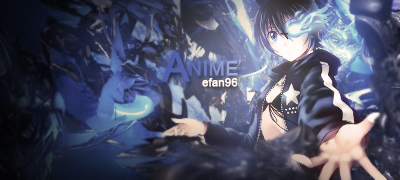
IMO:
- the background colors to the far left and top right should be dimmed to a lighter blue.
- the text colors strain the eye when looking at them on that background.
- some areas on the render seem to be blurred with the c4d (the shoulder). Those areas and some other areas need some erasing done
- background looks a little overblurred

this one is good. Better than your previous 7.1/10


Original Link :

IMO:
- the "A" in "Anime" blends too much with the background. Need to change the blue to something like the "-ime"
- dont know what that light blue thing is near the renders right hand. Doesnt fit with the image
- Hands are blurred a bit too much. Lower the blur a bit and it will look good

Render blends in nicely with the background. Text colors and effects are nice. The only problem in this image that I can find is the random light blue thing and the blurring. 7.9/10

Idk what anime is this lol


Original Link :

IMO:
- dim the green near the right ear on the background. Make it a lighter green or the color near the top of the violin (the color thats not green; yellow?)
- the text "efan96" needs to stand out more. White would have been a better choice to use here. "peaceboy" looks nice, but I think a bottom should be the green on the top part of it and the top part should have a lighter green (this can be done easily with the gradient tool)
- bottom left seems to be blurred a bit too much.
- try adding a drop shadow behind the render
- a border on the image would look nice

Looks good. The render has nice lighting and the image looks clean. 7.6/10
 
dat face
Loyal Member
Joined
May 25, 2012
Messages
1,738
Reaction score
621
I need to change this thread title ..


Original Link :


Original Link :
 
dat face
Loyal Member
Joined
May 25, 2012
Messages
1,738
Reaction score
621


Original Link :
 
Back
Top