New Style

Status
Not open for further replies.
Joined
Sep 13, 2007
Messages
1,425
Reaction score
204
oh gnoes big canvas!
Batz - New Style - RaGEZONE Forums
 
Wow, much of a nature style in it.
A little bright; nice. I like how you put the lens flare in the right position.
Great work more achievement will come.
 
Yah, too bright but nice way of light source and nice 'BATZ' text, but 'ENLIGHTENMENT' text needs should go. The Batz text is a little bright thow and unclear, it doean't 'need' change, but it would be better if you made it more visible. And it isn't a new style, it's just a light sig with a abstract BG and vector brushes over it.


BTW: Love the render, looks quite high quality.

________________________________________
But a good way to darken it is to make a new layer and paint it blackish-yellow or blackish-green (colors in the sig). Or even make a gradiant with all the diff colors in the render but make sure o keep them really dark!

Next set the layer to soft light, color burn or overlay. Then just screw around with the types (EG: have 2 layers, 1 color burn other overlay) and opacities of the layers.

And if you find it too contrasted but has the right light, just go to brightness and contrast layer and lower contrast


OR

If you like the quick way, make a contrast/brightness layer and just ness with those settings til you like it even more.


________________________________________

LOL, I like the short way, but you know. The long way usually gives me time to screw around with other settings while doing those.
 
Yah, too bright but nice way of light source and nice 'BATZ' text, but 'ENLIGHTENMENT' text needs should go. The Batz text is a little bright thow and unclear, it doean't 'need' change, but it would be better if you made it more visible. And it isn't a new style, it's just a light sig with a abstract BG and vector brushes over it.


BTW: Love the render, looks quite high quality.

________________________________________
But a good way to darken it is to make a new layer and paint it blackish-yellow or blackish-green (colors in the sig). Or even make a gradiant with all the diff colors in the render but make sure o keep them really dark!

Next set the layer to soft light, color burn or overlay. Then just screw around with the types (EG: have 2 layers, 1 color burn other overlay) and opacities of the layers.

And if you find it too contrasted but has the right light, just go to brightness and contrast layer and lower contrast


OR

If you like the quick way, make a contrast/brightness layer and just ness with those settings til you like it even more.


________________________________________

LOL, I like the short way, but you know. The long way usually gives me time to screw around with other settings while doing those.

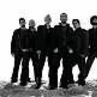
It's my new style...
Thanks for the tips
 
Status
Not open for further replies.
Back