Oct 2, 2006 #1 shadowmist rd is creative Loyal Member Joined Nov 3, 2004 Messages 1,411 Reaction score 1
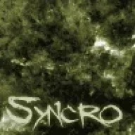
Oct 2, 2006 #2 Flawz Custom Title Activated Loyal Member Joined Aug 17, 2004 Messages 3,143 Reaction score 23 The font is way too blurry, otherwise it looks awesome.
Oct 2, 2006 #3 Bionic. Experienced Elementalist Joined Jul 23, 2006 Messages 256 Reaction score 3 Its kinda sharp and blur and what are those boxes next to the text ? and i agree with Flawz on the text , i dont like this one =/
Its kinda sharp and blur and what are those boxes next to the text ? and i agree with Flawz on the text , i dont like this one =/
Oct 2, 2006 #4 Syncro Newbie Spellweaver Joined Sep 26, 2006 Messages 96 Reaction score 0 Flawz said: The font is way too blurry, otherwise it looks awesome. Click to expand... totally..
Oct 2, 2006 #5 Rishwin Captain of the Universe Legend 10,000 Posts Got A Reaction Trophy Point Collector 20 Happy Years Legends Never Die Joined Oct 2, 2004 Messages 13,049 Reaction score 1,569 i find this to be the case with all of shadow's sigs - the text is not there to be read, its actually part of the design. loving it as always shadow <3
i find this to be the case with all of shadow's sigs - the text is not there to be read, its actually part of the design. loving it as always shadow <3
Oct 2, 2006 #6 shadowmist rd is creative Loyal Member Joined Nov 3, 2004 Messages 1,411 Reaction score 1 thanks
Oct 3, 2006 #7 Jhewt Feeling old Legend 1000 Posts Trophy Point Collector 20 Happy Years Legends Never Die Joined Dec 5, 2004 Messages 2,781 Reaction score 86 Looks awesome like always.
Oct 4, 2006 #8 badessmagic Newbie Spellweaver 10 Happy Years 20 Happy Years Joined Nov 3, 2005 Messages 8 Reaction score 0 pretty good