• Unfortunately, we have experienced significant hard drive damage that requires urgent maintenance and rebuilding. The forum will be a state of read only until we install our new drives and rebuild all the configurations needed. Please follow our Facebook page for updates, we will be back up shortly! (The forum could go offline at any given time due to the nature of the failed drives whilst awaiting the upgrades.) When you see an Incapsula error, you know we are in the process of migration.

Ghost Recon

d.^.^.b
Loyal Member
Joined
Mar 31, 2008
Messages
1,344
Reaction score
38
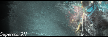
Hello RZ Ghost Recon sig didnt come out that good didnt know how to do displace filter never used it before so i tried something new.

Comment and Rate Please

superstar911 - Ghost Recon - RaGEZONE Forums
 
Newbie Spellweaver
Joined
Jun 23, 2010
Messages
11
Reaction score
0
Covered the main part of the sig with too much space ^^

I think if you made the right side a little more clear would make it look better. And you can experiment with a weaker smudging on the left side. You can even add a flowing C4D or some sort of other object.
 
d.^.^.b
Loyal Member
Joined
Mar 31, 2008
Messages
1,344
Reaction score
38
yah true i felt the left side was bare as heck cause of the way the render was it looked better on the far right instead of the middle
 
Initiate Mage
Joined
Apr 28, 2010
Messages
3
Reaction score
0
I know what you mean. I find it a bit tricky to use displacing on renders.

Your image also seem a bit squished.
 
d.^.^.b
Loyal Member
Joined
Mar 31, 2008
Messages
1,344
Reaction score
38
yah i tried to add some effect with it flowing in a certain direction as well with the displace but just didnt work i guess
 
d.^.^.b
Loyal Member
Joined
Mar 31, 2008
Messages
1,344
Reaction score
38
HAHA What? told me the same thing haha idc about the font if i want to use as actual sig ill make it flow alot more its just something to show that i made it
 
Back
Top