New Theme Bugs

I unfortunately don't have the time to look through the thread right now, so I'm sorry if that was already posted.

At the user profiles, the name and rank are very hard to read. It's probably the hardest to read with userrank Gamma.

Examples:
Vc2Ly3X.png


https://forum.ragezone.com/members/343903.html
https://forum.ragezone.com/members/819072.html
https://forum.ragezone.com/members/1333366339.html

Maybe make a white outline or change the bg for it to white or something, dunno :)


//edit

Also, again not sure if already asked:
zBEo41e.png

Weren't thread titles for unread posts bold? In my opinion it would be more clear to have something in addition to the icon :)
 
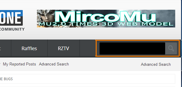
This was brought up by @Joopie but I'm bringing it up again. Is there any chance you could possibly change the search input to a grey color such as this below? it's not a bug or anything just a suggestion, overall the site looks beautiful.


How it is now:
jivJ3FD.png


How it would look when changed:
WBX8xvA.png
 
Last edited:
"New Subscribed Threads" don't have <b></b> on links, meaning I can't see witch thread is new and witch is old.
 
"New Subscribed Threads" don't have <b></b> on links, meaning I can't see witch thread is new and witch is old.

Was mentioned couple of times :)

I'm for the gray search box!

Oh btw thanks for soo much customization :) (Hopefully the style doesn't change again!)

Ygo89T8.webp
 
Last edited:
Was mentioned couple of times :)

I'm for the gray search box!

Oh btw thanks for soo much customization :) (Hopefully the style doesn't change again!)

Ygo89T8.png

Done, also -- clear your front end browser cache as the resized buttons are not showing on yours.


"New Subscribed Threads" don't have <b></b> on links, meaning I can't see witch thread is new and witch is old.

Maybe if you ask @Nathalie nicely she will ;)

-- edit; all unread threads are now bold.
 
It would be more consistent and nice if these were all the same size.

404_image.png


There is also some spacing issues here:

404_image.png


Also the scroll option in signatures is no longer there. Not sure if these had been already reported but yeah.

I am having the same issues as asesinato I tried clearing cache and changing themes with no luck.

EDIT: These buttons might also need some aligning. The text colour next to the plus sign might also need changing, can barely see it.

404_image.png


EDIT 2: asesinato appears to have customised his profile, hence the text colour can't be seen, not sure if there is a fix for that or just up to users.

EDIT 3: These should also be changed in size if the other ones are. Just all of them really.

404_image.png


EDIT 4: After clearing cache the logo at the top seems to have reduced in quality, to the extent where I can see it :/
 
Last edited:
Back