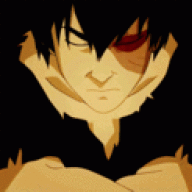
The small text is barely readable, colors seem to match, lighting doesn't especially on the text. Smaller tags look better because ... well they are small. Try making smaller tags or go straight ahead to wallpapers xD
Pretty sure the small text is meant to be un-readable. It's a style.
Anyway it looks really good! The lighting around the render and the placement of the text is pretty well done.
Only thing is that im not really sure where the lighting is coming from. For example behind the render there's a white lighting area -- without a source.
I like the depth you created. but i think the top right is to bright compared to the bottom. I know this is sort of where the lightsource would be coming from but since it looks like those sparcles are behind the character it can't be the lightsource itself.






 !